|
Of all the forms of non-verbal communication, color is the most instantaneous method of conveying messages and meanings.
Color adds tremendous meaning to communication as it creates a visual message, delivering an instantaneous impression that is most often universally understood. This is especially important in conveying a mood or idea where verbiage is not used or understood.
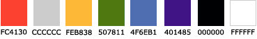
Five distinct colors make up the Children's color palette. You'll see these colors consistently, in building signage, brochures, fliers and other materials around our hospital. Each color conveys a different trait: warmth, energy, relaxation, tranquility and passion.
|
|
PANTONE® 7417 Cooler shades of orange, such as PANTONE 7417, behave much like yellow cheerful, expansive, rich and
extroverted although somewhat more restrained. This shade of orange garnishes high visibility and demands attention,
while retaining an understated quality of maturity and warmth. |
|
PANTONE 142 Most colors tend to darken when fully saturated. Yellow is the one hue that is brightest
at maximum saturation, as exemplified by PANTONE 142. Yellow is the most luminous color in the spectrum
and, subsequently, is the first hue to be recognized by infants. |
|
PANTONE 576 Earthy shades of green, like PANTONE 576, share the ability to delight the eye without fatiguing it. Stemming from its ease
of perception, this shade of green is often associated with the qualities of relaxation, stability and security, and is prominently represented
throughout nature and the flourishing life cycle.
|
|
PANTONE 2727 While darker, murky shades of blue may feel cold or depressing, lighter and fresher shades
of blue, like PANTONE 2727, often have been credited with the ability to lower blood pressure, calm the
nerves and soothe the soul. Blue surroundings, if not too dark, have been known to increase productivity.
|
|
PANTONE 266 While richer shades of violet, such as PANTONE 266, communicate sophistication and
sensitivity, lighter shades often appear artificial and unsettling. Violet is often associated
with internalization, sublimation and depth of feeling. At the same time, it is synonomous with passion and fascination.
|
|
| The colors shown in the palette below show the HTML Hex representations of the approved Children's color palette. |
|
|
|
|