The bright blue color scheme selected to represent ChildNet is directly reflective of the palette used on the original ChildNet site. The image below illustrates the color placement on ChildNet.
 The red, yellow, purple and green shown in the palette below are used to accent various departments or areas within ChildNet similar as to how they are used throughout the facility. The red is the color selected to highlight navigational arrows. Light gray dotted lines act as visual dividers between copy and navigation items. 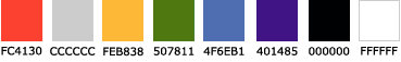 |