| Because the Intranet is intended primarily to be a vehicle for information exchange, extensive use of photography is not recommended. While every page on the Intranet is important, not every page will need a photograph. Discretion should be used when deciding which pages need more attention called to them through the use of photography. Keeping pages as clean and simple as possible with carefully selected imagery will aid in a rapid download of needed information while still providing interest.
In an effort to maintain consistency across pages appearing within ChildNet, specific photography guidelines have been created for the templates. Generally speaking, all photographs will appear in a rectangular or square format. This simplifies production, aids in the updating process, and again promotes consistency. However, photos can be combined and arranged in many ways to create a more dynamic feel without compromising the overall look of the pages. See examples of photography arrangement below. 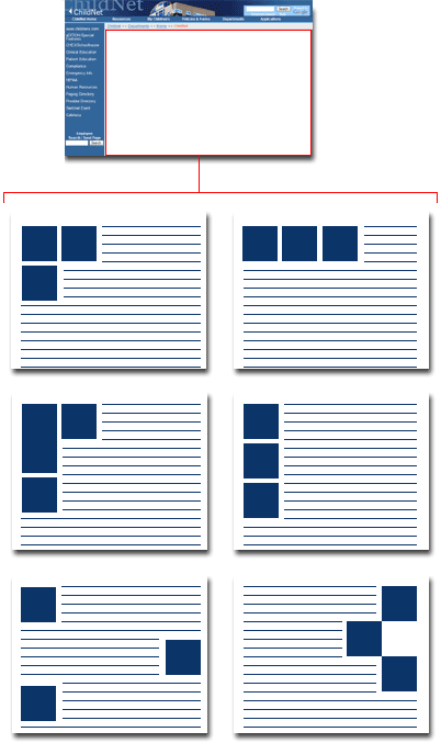 When considering the size of images, there should be a direct relationship between the photos and the content or copy associated with them. For example, a larger-than-average photo placed next to a short sentence looks unbalanced. Similarly, a long scrolling page of copy with a tiny photo placed near the bottom of the page looks equally unbalanced. A sense of balance is a goal to strive for when deciding on photograph size. 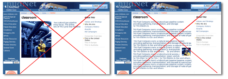  Using dominant departmental title images also detracts from the continuity of the intranet. Creating large graphical titles detracts from the Children's logo. The Children's logo should be more important than departmental titles. Do not use large departmental title images such as the example below. |