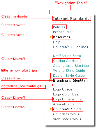
| Right Navigation is located on the right side of Template01 and Template02 pages. See the image below, and note that the navigational elements have different levels showing different colors. The following example depicts Right Navigation expanded to the tertiary level.
The Left Navigation items within the "Intranet Standards" section are depicted in blue. "Resources" is black with a gold arrow, which indicates that the user is in the "Resources" section. Within the "Resources" section are secondary items that are below the Left Navigation and depicted in turquoise. This example shows that the user has selected "Design Style Guide" (again, note the black type with the gold arrow). At the tertiary level, directly below the secondary items, the navigational elements are gray, with selected items shown with black type and a gold arrow. "Children's Colors" is the selected item within the tertiary navigation. This method of navigating is described as bread crumbing, as the user is always able to see where he or she has come from. *Note, when "mousing over" navigation elements, the elements will change in a "hover" state. When the item is actually clicked on, the gold arrow will appear beside the selection, and the selection itself will remain black.
 |
 |